If you were gifted with the ability to shape letters, I commend you.
I am not a type designer. I find the work difficult, repetitive, and tedious, and the required skills are above my pay grade. I am, however, someone who uses typefaces for a living. As graphic designers, we’re often tasked with choosing a font for a book cover, layout, or animation, and as people who don’t typically draw the typefaces ourselves, we act more as typographic art directors, picking and choosing the best font for the format, balancing taste with appropriateness and harmonizing legibility with form. For the record, I swap between the terms font and typeface interchangeably, as the distinction holds far less meaning than it did in the days of metal type.
So, from my completely subjective perspective, what’s the state of type design as someone who gets paid to use fonts? I wanted to take a survey of the landscape of the scene by looking at what fonts are being drawn and why. What problems are infecting typography, and where should type design go next?
PART 1: COMIC SANS
Most professional type foundries these days stick to the standard categories of fonts: the sans, the serifs, the monospaces.
I find the differences between Arial and Helvetica minimal (nothing wrong with a droopy “R”), Univers to be barely different, and Neue Haas Grotesk to be kissing cousins to Neue Haas Unica. Designers will spend years of their lives homing in on the details of a single family, hoping for a hit like Helvetica, and end up drawing something that just looks like… Helvetica, when there is so much more out there to be examined. As the market loves milquetoast (just look at the best-selling fonts on MyFonts1—at the time of writing, it’s mostly the aforementioned sans serifs and Instagram-friendly hand-drawn scribble)—you can’t fault type foundries for playing this game. Graphic designers love our simple sans minimalism (and our clients do, too), but rarely do you see type foundries pushing forth new aesthetic futures in place of basic fonts for the masses.
If you are looking for the true avant-garde of typography, I would not recommend traveling to your favorite foundry, or to the portfolio site of a recent graduate from a top-level design school, but instead to a little website called dafont.com.2 The most expressive typographical excursions can be discovered here, a place where legibility is pushed to the brink and corporate logo bootlegs run free.
This isn’t to say that there aren’t hideous crimes lurking on the website—most notably on the offensive “Foreign Look”3 section, which includes fonts such as “Chinese Dragon” and “Arabic Magic” (I’ll also mention the highly regrettable “Sexy” section)—but there are real moments of beauty and expression that exist well outside the boundaries of rules and taste. It arguably has the best collection of free pixel fonts on the net,4 a glorious collection of poorly drawn5 corporate logo6 bootleg fonts,7 groovy fonts,8 fire fonts,9 and even fonts made of ice.10 There’s something for everyone over at Dafont.com and its low bar for entry has allowed for typographic expression to flourish on the web. Free font sites like Dafont and 1001 Free Fonts have been around since the early days of Web 2.0, and their continued existence is a testament to their staying power in the face of the homogeny imposed by sites like MyFonts and other, more corporate typeface entities that now undermine typography itself.
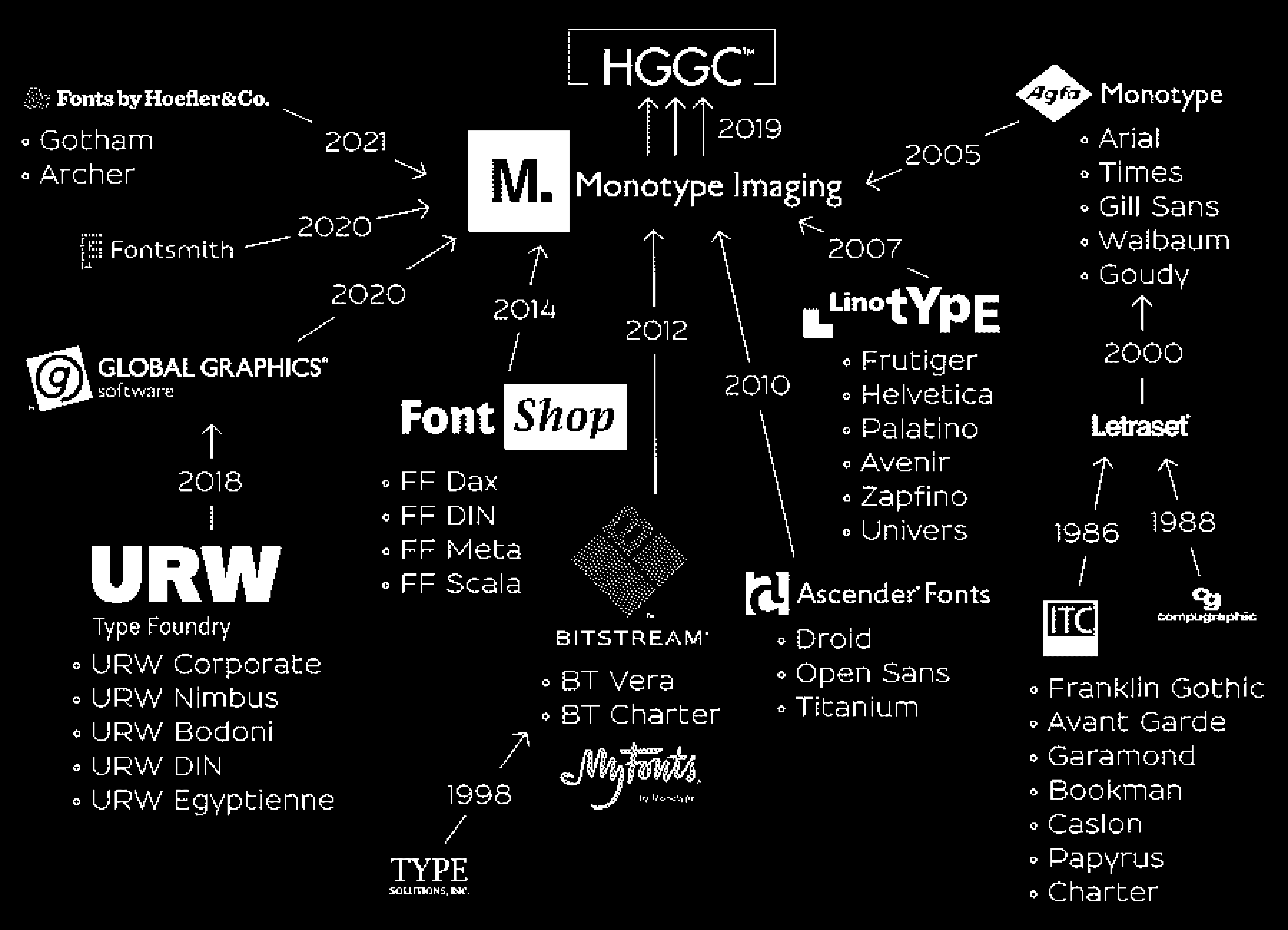
Illustration by @glukfonts, 2024 Courtesy of @typographicafonts
PART 2: BANK GOTHIC
Nothing threatens the typography industry more than Monotype Imaging Holdings Inc., better known as Monotype.
In name, Monotype is a type foundry, but it also acts as an investment owned by HGGC,11 a private equity firm with holdings in Planet Fitness, Beauty Industry Group (a supplier of hair extensions), and the “innovative dental service organization” Dentive. Monotype’s modus operandi in recent years has shifted toward acquiring smaller type foundries to seemingly increase profits and future investment opportunities rather than designing new letterforms or advancing typography.
The fact that Monotype is essentially a monopoly, even in name, feels somewhat on the nose. Every few months, it feels like we see a new headline that more and more independent foundries are selling their stock in fonts, shutting down their operations, and cashing in. A sale to Monotype usually means that there will be no new typefaces produced, as another branch of the tree of typography is cut off, with the foundry’s typefaces joining up with the biggest corporation in the business. It is of no fault to the foundries themselves, as selling to Monotype is one of type design’s only financially rewarding retirement plans. And it should not be seen as a point of shame to anyone for going this route, as the system itself can be inescapable without a radical shift in the industry.
The real danger here with Monotype devouring all these foundries is that if HGGC ever finds Monotype to be unprofitable, they could simply sell it to a lesser venture capital company or, even worse, discard it all, erasing a whole era of typographic history. In fact, as recently as 2023, HGGC explored selling Monotype for a whopping $4 billion,12 a comically large sum that would dwarf the valuation of every other type foundry. Once Monotype is sold (and it likely will sell, as selling is the goal of venture capital), the future of the largest library of typefaces in existence hangs in the balance, as acquisitions rarely end well for companies traded like commerce instead of art.
Increasingly, it feels like there are few type foundries left that haven’t been bought and sold for parts and scraps to Monotype’s font-eating mega-machine. One of the first examples was in 2014 when Monotype purchased FontShop13 for £7.5m, one of the last large independent digital font retailers (Monotype had purchased MyFonts14 in 2011 for $50m), from Erik Spiekermann in a huge blow to the online typographic ecosystem. More recent examples of its acquisitions include Jonathan Hoefler’s selling of Hoefler & Co., home to numerous typefaces drawn by Tobias Frere-Jones, which he allegedly did without informing his employees beforehand.15 Type foundries such as URW,16 Colophon,17 Fontworks,18 and Font Bureau,19 just to name a few, have also recently sold their businesses to Monotype.
Dinamo, 2023
That isn’t to say there isn’t resistance against this threat. As the specter of Monotype has grown over the type design community, some signal this shift away from being grabbed by Monotype’s tendrils. Matthew Rechs, the CEO of Type Network—a network that represents more than 100 foundries—ended their partnership with Monotype in mid-2024, stating that20 a continued partnership with Monotype was not compatible with their values. He was “alarmed by Monotype’s increasingly aggressive and litigious approach to customers,” stating that21 he could not “tolerate the lasting damage being caused by these escalating practices, which pose a threat to the future of our industry.”
One perspective on the current state of affairs comes from the renowned designer—and Hoefler’s former business partner—Tobias Frere-Jones, who stated, “Imagine if 70% of movie studios and TV production companies were owned by the same parent company. What do you think we would be watching?”22 Monotype’s former UK type director and celebrated Lebanese type designer Nadine Chahine laid it out plainly: “It’s the future of our industry at stake and it’s never been this bad. With every new acquisition, it gets worse for the rest of us.”23 More bluntly, Frere-Jones Type’s Nina Stössinger described Monotype24 as a “Kraken eating this industry” and Kris Sowersby of Klim Type Foundry, home to some of the best typefaces of recent years, stated, “I’m sure as fuck not letting Monotype anywhere near our fonts.”25
One perspective on the current state of affairs comes from the renowned designer—and Hoefler’s former business partner—Tobias Frere-Jones, who stated, “Imagine if 70% of movie studios and TV production companies were owned by the same parent company. What do you think we would be watching?”22 Monotype’s former UK type director and celebrated Lebanese type designer Nadine Chahine laid it out plainly: “It’s the future of our industry at stake and it’s never been this bad. With every new acquisition, it gets worse for the rest of us.”23 More bluntly, Frere-Jones Type’s Nina Stössinger described Monotype24 as a “Kraken eating this industry” and Kris Sowersby of Klim Type Foundry, home to some of the best typefaces of recent years, stated, “I’m sure as fuck not letting Monotype anywhere near our fonts.”25
Graphic on FontShop Homepage featuring founder Erik Spiekermann, 2014
I salute these type foundries and hope that they stand strong. I pray the day never comes when Dinamo, Commercial Type, Grilli Type, or any other of the remaining typographic luminaries fall victim to Monotype’s alluring offer of cash for fonts.
PART 3: THE MR. SHRIMP FONT
Beyond the monopolies and the monotony, the future of typography is not all doom and gloom, and there is boundless beauty being produced beneath the surface.
The best type foundries do not rely on the basic sans serifs to lay the foundation of their business but also stretch the limits of aesthetics with dazzling display type rooted in a strong understanding of form. Think the bravery of DaFont’s aesthetics married to the skills of Hermann Zapf.
Swiss foundries like Lineto have been the masters of this, releasing typefaces that speak both to the past and the future, such as Norm’s LL Replica26 with its cut corners, or the original LL Brown27 by Aurèle Sack with its backward slant. Dinamo’s typefaces also come to mind with examples such as ABC Favorit Lining,28 a straightforward sans with a twist (an underline marking the bottom of the entire typeface). And My-Lan Thuong’s Carta Upward29 designed for Sharp Type breaks the rules of baseline typography, asking its users to set its forms upward and downward, not just right and left, calling to languages outside of basic Western forms.

The Mr. Shrimp Font, Erik Carter, 2011
Overall, I’m less excited about variable typography technology, as I think designers should be confident in their choices of weight rather than twiddling the nobs with uncertainty. I’m not saying that there aren’t interesting excursions happening with these variables, such as seen with Andy Clymer’s Tilt,30 a variable font that allows its users to rotate the orientation of the glyphs, bending in ways that letters have rarely bent before. The Vectro Type Foundry is also leading the charge in experimental variable typography, with brave fonts such as the three-dimensional WHOA31 or the gloriously groovy Kablammo32—a wonderful variable update of 1995’s misunderstood Jokerman33—that would feel right at home on DaFont.
On the business side of things, there are also exciting developments that aim to upend the traditional model of hoping for a hit typeface or a big licensing deal to support a foundry. Future Fonts34 has a brilliant model of selling typefaces in progress that allows type designers to try out new weird things without the heavy time investment involved in drawing an entire font family, all while letting us graphic designers get in on the ground floor for cheap. My favorite typefaces from one of my favorite foundries, Commercial Type, are not found on its main site, but in its Vault,35 a repository of unreleased typefaces and experimental flights of fancy, all in various states of completeness. Source Type functions as “a collective, a platform, publisher, a mixtape, and a conspiracy”36 essentially releasing excellent essays around design and typography, alongside solid typefaces. Sharp Type has explored new avenues in typographic marketing with Sharp FM, DJ mixes with artwork featuring their new typefaces, marrying audio with visual form.
I urge type foundries to take these kinds of routes as we, ignorant designers, can sometimes struggle to see the flaws that type designers are dialed into. Graphic designers don’t just function as typographic art directors; they serve as critics and collaborators and, at times, as their own type designers. The relationship between typographer and designer should be a harmonious one. So, type foundries, please open the gates to all your unloved typographic children and let the graphic designers run wild with your letterforms!
An earlier version of this essay,37 edited by Madeleine Morley, was published in Dinamo’s online journal, Editions, on April 3, 2024.